Improve your paint pics in 5 quick steps
Posted: Sun Apr 19, 2009 6:13 am
Five tips to fix your paint drawings
As spudders, one of the crude computerized tools we use is paint which is a drawing program that came with pretty much every windows computer. If you have mac, linux/unix o.s. or whatever then this should be adaptable for the program you use.
1. Small Scale:
Instead of drawing a large, wonky image I prefer to use the zoom function to 6 or 8x to allow production of a smaller, more detailed image. Doing this also allows you to make use of one of the greatest paint tools, the grid.
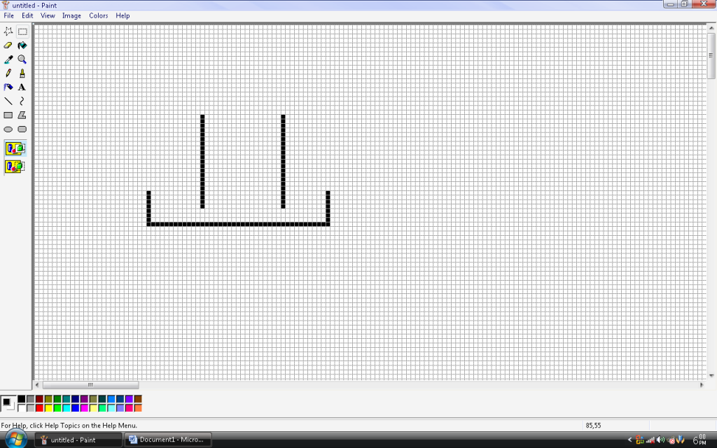
To access the grid, hold control (Ctrl) and press “g”. This will bring up a 1x1 pixel grid across the screen. Without a zoom, this is rather useless but at 6 or 8x it allows for very precise drawings, and makes scale work easier to achieve. Eg. 1 pixel = 1 centimeter.
To upsize your images later, you can use the sketch/skew tool, select and drag, use Ctrl++ or improvise the print screen key with the zoom.
2. The key to a good drawing:
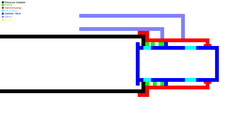
A good drawing is easily ruined by having it in one tone; it’s much easier to understand if you use a color coded key to the image to help illustrate the point you want to get across. If you run out of colors, you can use the custom color palette tool to select another color, and then drop it into your tray.
Oops, you drew your image first and didn’t do a key while you were drawing, and half of your colors were custom ones and not in the tray? Easily solved. Simply use the pipette (eye dropper) to select the color you wish to key.
3. Transparency
This seems like a rather dead-dumb thing to include, but I’m still surprised how many people respond with “wtf?!?!?!?!?!/1shiftone” when I tell them to use transparency while dragging things around in their image. To activate transparency select a mode such as select, then choose the overlapping mega-blocks.
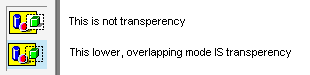
What’s so great about this transparency thing? It basically gives white a priority of zero. This means that when you drag a picture that has white in it the white disappears and does not overlap the image you’re placing it onto. I’ve found that the most useful use for this is placing text on top of an image..

When blown up to a magnification or 8x you can clearly see the devastating effect placing a piece of text over our lovely Kirby without transparency has. This goes for larger images as it’s a lot easier than going along with a 1 pixel brush and fixing every cut out piece.
4. Making templates:
I find it amusing when people draw up a nice image with a good key and all. Yet they note that the pipe is all (whatever size) except there’s 3 different sizes..it gets confusing.
We’ve all seen it, and it gets mighty confusing.
So sure, you could zoom in and use the grid, but to be honest we don’t always want to do that. So how do we achieve consistency in our pipe sizes, and even our fittings?
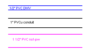
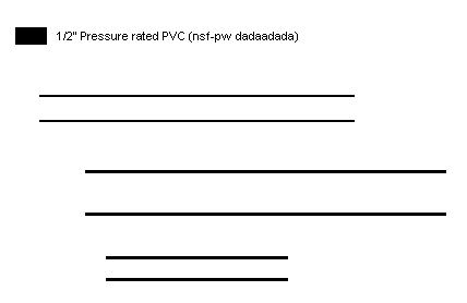
It doesn’t have to be to scale, this just keeps it consistent.
Before drawing up the cannon I draw pipes using the line tool in the sizes I will be using in the cannon. You need to make sure that each piece of pipe is longer than the longest piece you will use, otherwise you end up having to glue them together.
Use the select tool and copy, along with our new friend transparency as a hacksaw to stick together your pipes.
That’s all well and good, but how about fittings? Seen as we’re using common pipe sizes we can do the exact same thing..
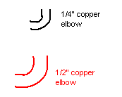
Just make sure you match them to the pipes your using.
5. Threads, springs and other annoying things.
Too many times I’ve seen a nice, well presented paint picture ruined by a “spring” being represented by lines across the page, same for threads.
For springs and threads I like the simpler option of a cutaway model; how you would see it if it was cut in half. This makes sense as you can see the inside of basically every drawn spudgun in paint.
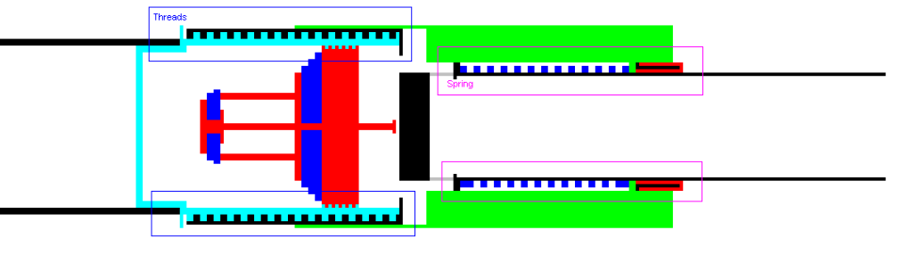
Here springs/threads are represented by alternating squares (circles are better). Don’t just dot them randomly, consider the spring you’re using. A tightly coiled spring may require 1 pixel spacing, while another may need four. No different for threads.
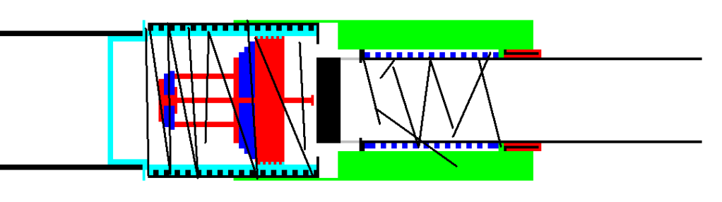
Ruins it, doesn’t it?
For you bludgers that didn’t read it? Here’s some quick hints
-Zoom in to 6 or 8x magnification and press control “ctrl”and G “G” to bring up a 1 by 1 pixel grid.
-Use the pipette/eye dropper/paint picker thingamijagonie to pick colors if you forgot to do a key as you were going along.
-(transparency)
-Try drawing templates to help you keep drawings consistent. You could even draw one complete set of templates of every fitting and pipe you could use. In fact..might do that- stay tuned.
-Oh god damn it, it’s the one right above this, just go back..
Erm..yeh
As spudders, one of the crude computerized tools we use is paint which is a drawing program that came with pretty much every windows computer. If you have mac, linux/unix o.s. or whatever then this should be adaptable for the program you use.
1. Small Scale:
Instead of drawing a large, wonky image I prefer to use the zoom function to 6 or 8x to allow production of a smaller, more detailed image. Doing this also allows you to make use of one of the greatest paint tools, the grid.
To access the grid, hold control (Ctrl) and press “g”. This will bring up a 1x1 pixel grid across the screen. Without a zoom, this is rather useless but at 6 or 8x it allows for very precise drawings, and makes scale work easier to achieve. Eg. 1 pixel = 1 centimeter.
To upsize your images later, you can use the sketch/skew tool, select and drag, use Ctrl++ or improvise the print screen key with the zoom.
2. The key to a good drawing:
A good drawing is easily ruined by having it in one tone; it’s much easier to understand if you use a color coded key to the image to help illustrate the point you want to get across. If you run out of colors, you can use the custom color palette tool to select another color, and then drop it into your tray.
Oops, you drew your image first and didn’t do a key while you were drawing, and half of your colors were custom ones and not in the tray? Easily solved. Simply use the pipette (eye dropper) to select the color you wish to key.
3. Transparency
This seems like a rather dead-dumb thing to include, but I’m still surprised how many people respond with “wtf?!?!?!?!?!/1shiftone” when I tell them to use transparency while dragging things around in their image. To activate transparency select a mode such as select, then choose the overlapping mega-blocks.
What’s so great about this transparency thing? It basically gives white a priority of zero. This means that when you drag a picture that has white in it the white disappears and does not overlap the image you’re placing it onto. I’ve found that the most useful use for this is placing text on top of an image..
When blown up to a magnification or 8x you can clearly see the devastating effect placing a piece of text over our lovely Kirby without transparency has. This goes for larger images as it’s a lot easier than going along with a 1 pixel brush and fixing every cut out piece.
4. Making templates:
I find it amusing when people draw up a nice image with a good key and all. Yet they note that the pipe is all (whatever size) except there’s 3 different sizes..it gets confusing.
We’ve all seen it, and it gets mighty confusing.
So sure, you could zoom in and use the grid, but to be honest we don’t always want to do that. So how do we achieve consistency in our pipe sizes, and even our fittings?
It doesn’t have to be to scale, this just keeps it consistent.
Before drawing up the cannon I draw pipes using the line tool in the sizes I will be using in the cannon. You need to make sure that each piece of pipe is longer than the longest piece you will use, otherwise you end up having to glue them together.
Use the select tool and copy, along with our new friend transparency as a hacksaw to stick together your pipes.
That’s all well and good, but how about fittings? Seen as we’re using common pipe sizes we can do the exact same thing..
Just make sure you match them to the pipes your using.
5. Threads, springs and other annoying things.
Too many times I’ve seen a nice, well presented paint picture ruined by a “spring” being represented by lines across the page, same for threads.
For springs and threads I like the simpler option of a cutaway model; how you would see it if it was cut in half. This makes sense as you can see the inside of basically every drawn spudgun in paint.
Here springs/threads are represented by alternating squares (circles are better). Don’t just dot them randomly, consider the spring you’re using. A tightly coiled spring may require 1 pixel spacing, while another may need four. No different for threads.
Ruins it, doesn’t it?
For you bludgers that didn’t read it? Here’s some quick hints
-Zoom in to 6 or 8x magnification and press control “ctrl”and G “G” to bring up a 1 by 1 pixel grid.
-Use the pipette/eye dropper/paint picker thingamijagonie to pick colors if you forgot to do a key as you were going along.
-(transparency)
-Try drawing templates to help you keep drawings consistent. You could even draw one complete set of templates of every fitting and pipe you could use. In fact..might do that- stay tuned.
-Oh god damn it, it’s the one right above this, just go back..
Erm..yeh
 </div>